Glanbia Brand Docs
Typography
Typography
The Glanbia Nutritionals typography is one of the recognizable cornerstones of our brand. Through the consistent use of our headline typeface, Intro, our brand has become recognizable through an established hierarchy and layout composition.
Heading Typeface
Intro
Intro is part of the sans serif family exhibiting a refined playfulness through subtle yet whimsical character. The letterforms are thick with low contrast with unique alternative playful characters. We primarily use the Black font weight for headlines but utilize the Bold and Regular font weights for pull quotes and paragraph leads. We always try to set Intro in sentence case to exhibit approachability and exploit the playful and casual details found in the lowercase letterforms.
Body Typefaces
An important consideration for the Glanbia Nutritionals brand is the selection of a stable and legible body text. Helvetica Neue has functioned as a core body font for Glanbia plc and has been used extensively by Glanbia Nutritionals. Runda is being introduced as the primary body text typeface specifically for digital applications.
Helvetica Neue
Helvetica Neue is used for body text in printed applications. Helvetica was reworked in 1957 by D. Stempel AG and released 26 years later in 1983 as Helvetica Neue. It is an extremely versatile typeface and has been used in every typographic project imaginable, including print, signage, movie titles, digital media, and more. Glanbia plc. has utilized Helvetica Neue as one of the primary body typefaces for the past several years.
Runda
Runda is used for body text in digital environments for optimal legibility. It exhibits simple shapes, open forms and elegant execution that communicate with clarity and confidence similar to Helvetica Neue. It produces a similar horizontal rhythm to Intro when compared to Helvetica Neue. With slightly elongated tails (such as the “t”) it compliments the charismatic letter forms of Intro. In addition to the elongated tails, Runda exhibits counter forms (such as the “a”) that more closely resemble Intro. The overall horizontal rhythm provides a much nicer compliment to Intro without exhibiting the sometimes obtrusive charisma of Intro which can be difficult to read at body sizes.
Substitute Typefaces
When there is not access to our brand fonts, Arial or Calibri can be substituted when working on presentations, internal documents, press releases, and reports. Use should be very limited and when possible contact the Glanbia Nutritionals marketing team with help integrating brand typefaces.
Hierarchy
It is important to organize typography in a hierarchical system according to the grid established by the Brandmark size. Establishing the typographic scale based on the Brandmark size ensures inclusiveness through scale and emphasizes the unique layout characteristics that Glanbia Nutritionals has become known for.
Establishing the Typographic Scale
Our typographic scale has been built to scale in relationship to the size of our brandmark. When implemented properly, the typographic scale provides appropriate size contrast, improves legibility and works harmoniously with our brandmark and tagline.
Type scale, grid and layout design can be overwhelming but used correctly it will strengthen our brand and provide consistency–something we strive for in all of our products. Our design team has established several templates as "quick starts" for typographic scale. For applications outside our templates, we have a handy Glanbia Nutritionals Type Gauge Multi-Tool as an assistant to establish a rock star type and grid system.
The Base Unit of measurement (BU) is equal to our logomark. Once the BU has been established, you can quickly build out the various heading and paragraph sizes. The following diagram depicts a typographic style established for traditional 8.5x11 applications. You can learn more about our use of the Base Unit of measurement in the Composition and Logo sections of this guide.
Layout Examples
Lockup One
Elements used: Eyebrow, Heading 1, body text
Lockup Two
Elements used: Heading 1, Lead In, body text
Lockup Three
Elements used: Heading 1, Lead In, body text, bullet list
Lockup Four
Elements used: Heading 3, Heading 5, body text, bullet list
Lockup Five
Elements used: Eyebrow All Cap, Heading 1, Heading 2, Heading 3, Heading 4, Lead In, body text,
Guidance

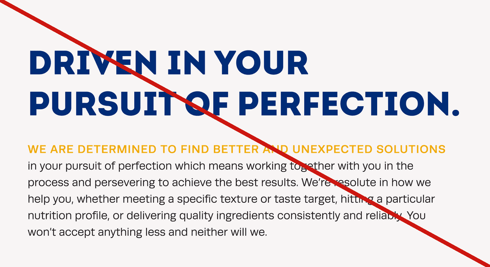
Don't use all caps for headings/lead ins or yellow for body text

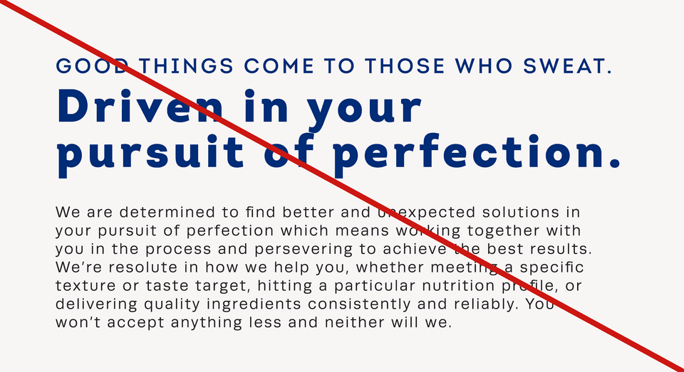
Don’t adjust kerning or tracking or break the rhythm of the before/after spacing

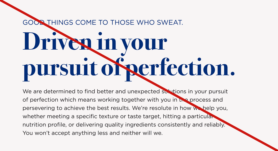
Don’t use non-approved / off brand typefaces

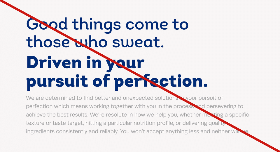
Don’t make different levels of hierarchy the same weight or set body text in light colors
Key takeaways
- Typography is a pillar of our brand
- Aim for contrast across type hierarchies