Glanbia Brand Docs
Logo
Logo
Our brandmark is the cornerstone of the Glanbia Nutritionals visual identity. It is made up of two components: the Logotype and the Logomark.
Logotype
Our name, Glanbia, has its roots in the Irish Language–Glanbia means "pure food" in Irish. (The name is derived from the Irish words glan (pronounced [ɡl̪ˠan̪ˠ], "clean"/"pure") and bia ([bʲiə], "food"). The Glanbia Nutritionals Logotype represents the nutritionals business group of Glanbia plc.
Logomark
The Logomark is made up of simple shapes inspired by the essential and elemental connection between science and nature. It draws a connection to the elements of nature that inspire Glanbia's visual identity: Land, Air, Sea, and Sun.
Brandmark
Our logo is constructed with the Nutritionals divisional name preserving the integrity of the Glanbia plc. brandmark. The Logotype should never be used in stand alone applications. However, in limited applications the Logomark can be used as a stand alone mark. For most applications, the Logotype and Logomark should not be separated to ensure that its impact and recognition value are not diluted through alteration.
Brandmark & Tagline
Glanbia Nutritionals utilizes the "We're built around you. Just add Glanbia." tagline. It includes a unique lockup of custom handwritten script and Intro typeface (our brand typeface for headlines). The tagline has a specific size relationship to our logo to preserve a harmonious size contrast. There are five variations of the tagline for various use cases.
Clearspace & Lockup
Brandmark Clearspace
To maintain the visibility and the integrity of the brand identity, protective clearspace has been created to set off the brandmark from type, photographs, illustrations, and other graphics. A Base Unit (BU) has been established derived on the the Logomark. 1 BU of clearspace is used on the top, left and bottom of the brandmark while ½ BU has been established for the right side of the brandmark. The ½ BU of clearance for the right side only provides a "hanging punctuation" effect. When using a grid, text and other effects should align with the right side of the "a" in our Logotype which will accentuate the hanging punctuation effect while providing a visual anchor. Always reproduce the brand mark from an original supplied by the Glanbia Nutritionals Corporate Marketing team.
Brandmark & Tagline Clearspace
The x-height of the tagline is ¼ BU. This size relationship plays an important role with establishing hierarchy and emphasis without overpowering our Brandmark. When the Brandmark and tagline are used in close proximity, they should be treated as a "unit" with specific clearspace requirements depending on layout. As a "unit", the Brandmark and tagline utilize the same 1 BU of clearspace that the Brandmark utilizes.
Tagline Left Lockup
When the tagline is placed to the left of the Brandmark, the baseline of the tagline should match the baseline of "nutritionals" in our Brandmark. 3 BU's represent the clearspace requirement between the tagline and Brandmark. Two different orientations (single line and stacked) are available depending on document width requirements. The lockups are treated as a unit with the same clearspace requirement for the Brandmark (1 BU).
Tagline Below Lockup
In applications where our tagline is not part of the core messaging or in applications where width requirements are narrow, use the Brandmark and tagline lockup where the tagline sits below the logo. A ½ BU is used below our Brandmark for clearspace requirements. The lockups are treated as a unit with the same clearspace requirement for the Brandmark (1 BU). It should be noted that the tagline should never appear directly above the Brandmark. In situations where the tagline needs to appear above the logo, the detached lockup and associated rules and clearspace requirements should be utilized.
Detached Tagline Lockup
When the tagline is utilized near body copy or detached from our brandmark, the minimum size requirement is still ¼ BU. However, in some applications you can increase the size of the tagline when detached from the brandmark. In those applications, the x-height of the "i" in Glanbia should never exceed the x-height of the "i" in our Glanbia logotype. The tagline should be treated similar to other graphics and the Brandmark should retain the designated 1 BU of clearspace.
Color
To ensure our brandmark has the best legibility in an application, it's important to pick the correct version and scale. There are four approved variants of the Glanbia Nutritionals brand mark: color positive, color reverse, mono color, and reversed.
Color Positive
For light or white backgrounds, use the preferred color positive. This version creates sufficient distinction between our brandmark and the background.
Color Reverse
In cases where the brand mark must be used on an image or field of color that is dark, use the color reverse brandmark to ensure sufficient contrast between our brand mark and the background.
Mono Color
In applications that may have color restrictions, you may use the mono color – positive (black) and Glanbia blue Brandmarks.
Reversed
For applications that the logo must appear on a colored backgrounds that conflict with the Glanbia Orange and Glanbia Yellow, you may use the reverse (white) Brandmarks.
Scale
The brandmark can be used down to a minimum size of 0.625"/16mm width for print and 141px width for digital (desktop/mobile). Digital applications in which the logo needs to be sized smaller than the preferred minimum 141px size should utilize the small-use digital logo which can be used down to 80px in width. The small-use digital logo features the "nutritionals" kerned out for better legibility. These sizes refer to the width of the actual artwork and do not include the clear space requirements.
Placement
Use the Glanbia Nutritionals brandmark as a signature in all of our communications. Whenever possible, include our tagline "We're built around you. Just add Glanbia." The brandmark placement depends on the type of communication and use. It is always important to use the preferred size with surrounding clear space to ensure consistency.
Bottom & Upper Right
The preferred location of the brandmark is the lower right-hand corner of the given composition. In instances where the brandmark can't be used in the bottom right due to layout, photography, or other constraints, place it in the upper right-hand corner.
Upper and Lower left
Placing the brandmark in the upper left or lower left is acceptable but should be used sparingly and with additional clearspace. Care must be taken so that the brandmark doesn't feel off balance when placed next to supporting elements.
Sub-brands
Sub-brands are represented in several ways under the Glanbia Nutritionals brand. As a rule of thumb, sub-brands should be limited and considered carefully as to not dilute the master brand.
Please be sure to use the correct trademark symbol depending on the status of the trademark. These symbols protect our marks. A registered trademark uses the ® symbol. A pending trademark uses the ™ symbol. If you’re unsure which to use for an endorsed brand, check with Glanbia Nutritionals Corporate Marketing.
Endorsed Brands
Endorsed brands typically have unique nomenclature that should utilize our primary headline typeface Intro. Identities should be set in title case and will often include blended words in title case. Endorsed Brands usually have unique supporting graphics; they do not, however, have unique Logomarks. The technology might be intellectually protected through patents and often names are protected through trademarks.
Segmented Brands
Segmented Brands are identities that have unique names and visual identity marks. They are typically of intellectual value for our customers to use based upon proprietary technology unique to our product and service. After the 2017 restructuring, the creation of Segmented Brands was reduced in favor of Endorsed Brands. Most Segmented Brands are supported legacy trademarks.
Organizational Brands
Organizational Brands are teams or initiatives within Glanbia Nutritionals that have a unique external facing brand. These identities should utilize our primary headline typeface, Intro. In unique circumstances they might require a unique visual identity that should follow the Glanbia iconography and illustration guidelines.
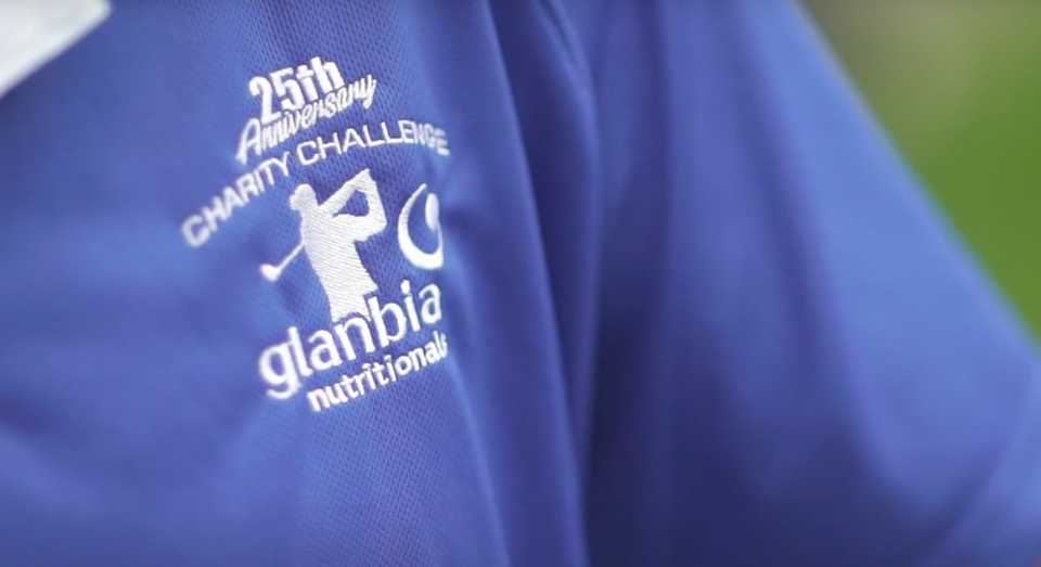
Partnerships
Aligning partnership logos should follow clearspace rules. The separating line between logos can be created using one Base Unit from the clearspace requirements. The partnership logo should never surpass the entire vertical height of the Glanbia brandmark.
Guidance
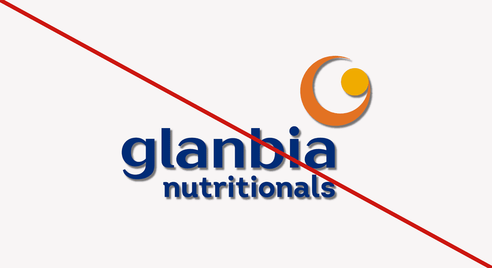
Don't add dropshadows or special effects
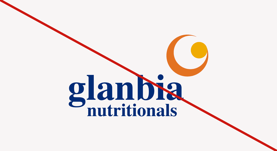
Don’t change the typeface of the brandmark
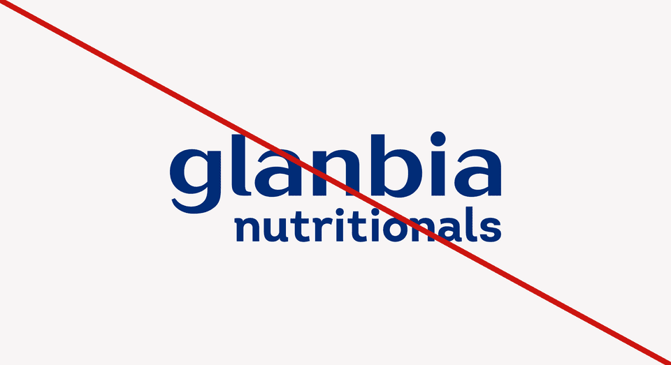
Don’t use the brandmark without the logomark
Don’t change the color or distort the brandmark
Key takeaways
- Create consistency
- Keep plenty of clearspace and use appropriate sizing
- Always try to align the logo on the right side of the composition
- Restricting use to full color only when on a white background and Mono Color on other backgrounds affords us the highest contrast ratio, aiding accessibility