Glanbia Brand Docs
Composition
Composition
Composition plays an important role in the Glanbia Nutritionals brand architecture. Our unique combination of typography, graphics, photography, color and layout work in harmony. Our grid system provides stability while the Energy Horizon introduces a familiar graphic representing our ever-present support of our customers.

Grid
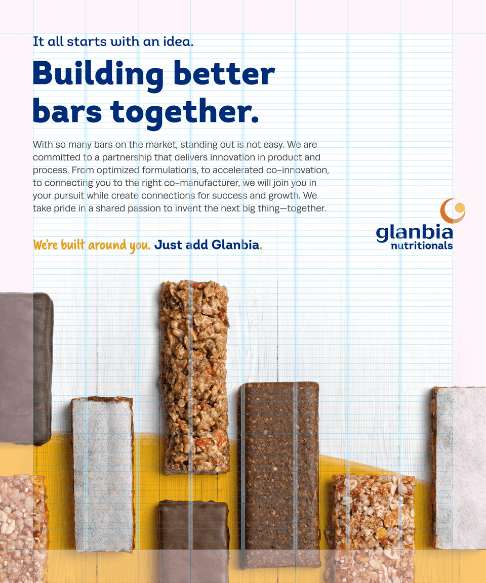
We use a flexible grid system based on our Logomark as the composition system. The system provides stability and a unique hierarchy with our headlines, body text, graphic and brandmark.
Grid Overview
Depending on the layout ratio we utilize several different column layouts. Following are the approved column layouts:
- 2 column - For narrow and tall layouts
- 4 column - For event banners, online ads, and pocket books
- 8 column - For 8.5 x 11 documents and similar layout ratios
- 12 column - Presentations and wide-format compositions
Grid Setup
Setting up the grid is straight forward once the Base Unit of measurement (BU) is established. The BU is equal to our Logomark. This standard unit of measurement ensures our hierarchy and layout components work in harmony next to one another. For an in-depth review of the Base Unit, please review the Logo section of this guide.
- Define the columns. Based on the layout ratio and the column guidelines, determine the number of columns that works the best for your composition. In this example we will setup an 8 column grid for a standard 8.5x11 document.
- Define the logo size or text size. Since our layout is dependent on the Base Unit, a quick way to establish the margins and columns is to place the logo roughly in the composition at the size that appropriate for the composition. Alternatively you can place the smallest text size you expect to use and extrapolate the logo size from the body or heading size. Don't stress the details just yet, this is just a starting point.
- Define the margins. Based on the Logomark size of the placed Brandmark, establish a Base Unit of measurement. If you started with text, establish the Brandmark size based on the guidelines outlined in the Typography section of this guide to determine the Brandmark size and BU. This will be the foundation for the margins of the composition. Depending on the layout size and composition, choose a comfortable margin width (typically 1 BU, 1½ BU, or 2 BU).
- Define the columns and column gutters. With the margins defined, apply the chosen column grid to the layout (in the example, an 8 column grid is applied). Distribute the columns evenly from the inside of the established margins. Establish the gutter widths based on ½ BU.
- Define the baseline grid. The baseline grid is optional and typically set to ½ of the leading point size of the body text. If body type is not utilized, establish the baseline grid on the leading from the smallest text size in the document. In our example, the composition uses 10pt/14pt body text. Taking ½ of the leading makes a baseline grid of 7pt.
Energy Horizon
The Energy Horizon Story
The Energy Horizon was conceived from the Glanbia brand history. Inspired by the elements of nature, it is an evolution of the Glanbia Nutritionals gleam and harmonizes with the Glanbia plc brand work. It represents a warm, rising sun horizon as a metaphor to a fresh new day full of possibilities and promise. The intercepting bands represent the energy and interlocking service of all of our disciplines such as R&D, Procurement and Leadership. It represents our ever-present support of our customers.
Layout Composition
The Energy Horizon provides an elegant way to reinforce the "We're built around you. Just add Glanbia." brand slogan. It should be utilized sparingly, never complex or distracting, and never forced into the composition. The layout composition should be a harmonious balance of typography, color, graphics and photography. The Energy Horizon plays a tertiary role in the design, primarily used as an embracing background component.
Layout Variations
We have two primary layout variations for the Energy Horizon - a Full Bleed Energy Horizon version and a Energy Horizon Band variation. Regardless of the version used, it should always appear to be rising - reinforcing the warmth of the sun and the energy we bring to innovation process.
Full Bleed Energy Horizon
The preferred and primary use of the Energy Horizon utilizes a transparent block of yellow in the shape of a rising sun. The border is complimented with bands that subtly intersect and represent an energy movement. The graphic should be incorporated into photography in a seamless manner that separates the subject from the background. The effect should feel natural and not overwhelm the composition. In most scenarios, the final photo asset would anchor the bottom of the composition.


Energy Horizon Band
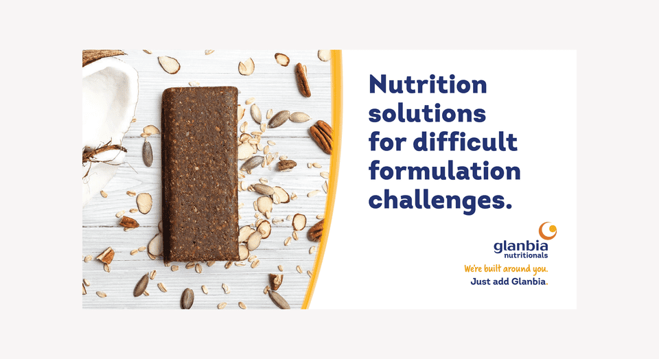
In scenarios where the photography is situated at the top of the composition or incorporating the Full Bleed variation is difficult, the Energy Horizon Band graphic can be used. This variation still incorporates the shape of the rising sun but is represented as a solid block of color, masking out the photography. The border is complimented with transparent bands that overlap the solid rising sun graphic.


Vertical Energy Horizon Band
In very limited situations the Energy Horizon Band graphic can be utilized in horizontal format. Whereas the Energy Horizon Band graphic utilizes the shape of the rising sun to mask the photography, the Vertical Energy Horizon band uses the rising sun shape as a clipping mask. The photograph becomes the rising sun shape. The border of the photograph is complimented with transparent bands that overlap the photo and solid background.s

Energy Horizon Band Variations
A critical component of the Energy Horizon is making sure the border energy bands stand out just enough to not distract from the composition. Several variations of the energy band and been pre assembled with various widths and overlaps. Utilize the variation that provides a balance of contrast without overwhelming the composition. Highly advanced compositions may require manual shifting of the energy bands.
Bringing it all together


Guidance

Do not rotate or flip the Energy Horizon (it will not longer resemble a rising sun)

Don’t change the color of the Energy Horizon or add special effects
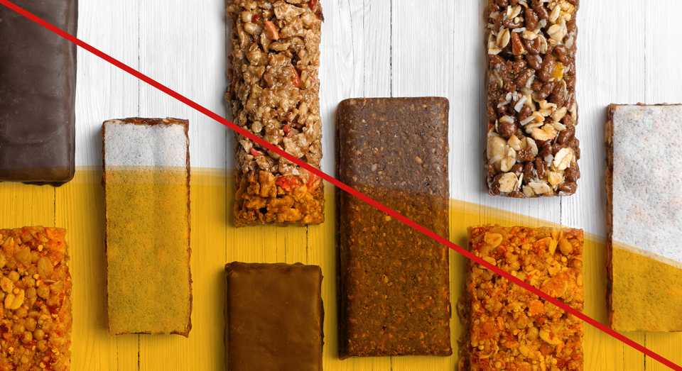
Don’t overlay the Energy Horizon without integrating it into the background of the image
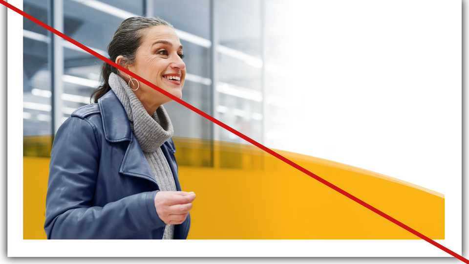
Don not use the Energy Horizon if full-bleed is not possible
Key takeaways
- Content dictates the format
- Stick to the grid and hierarchy of type and brandmark
- Don't force the Energy Horizon
- Reserve the Energy Horizon for key moments